


Exceptional products don’t begin with screens; they begin with strategy. Before choosing colors or placing buttons, designers move through a layered set of decisions that shape the user experience from within. Jesse James Garrett’s 5 Planes Framework, introduced in The Elements of User Experience, remains a powerful model for navigating this journey.
In this post, we revisit this framework not as an abstract theory but as a practical lens for aligning UX activities across the product lifecycle. Because design thinking isn’t a garnish added at the end, it’s the base ingredient that shapes everything.
To make this layered concept relatable (and memorable), let’s use a metaphor: a burger.
Designing a digital product is like preparing the perfect burger. Each layer, from strategy to surface, adds structure, flavor and integrity. Miss a layer and the experience falls apart. Get them all right and you deliver something that’s not just functional but meaningful.
To ground this further, we’ll pair the burger analogy with medtech examples such as designing a patient monitoring system or clinical dashboard. Hence, each concept translates into a real-world application.
The 5 Planes Framework
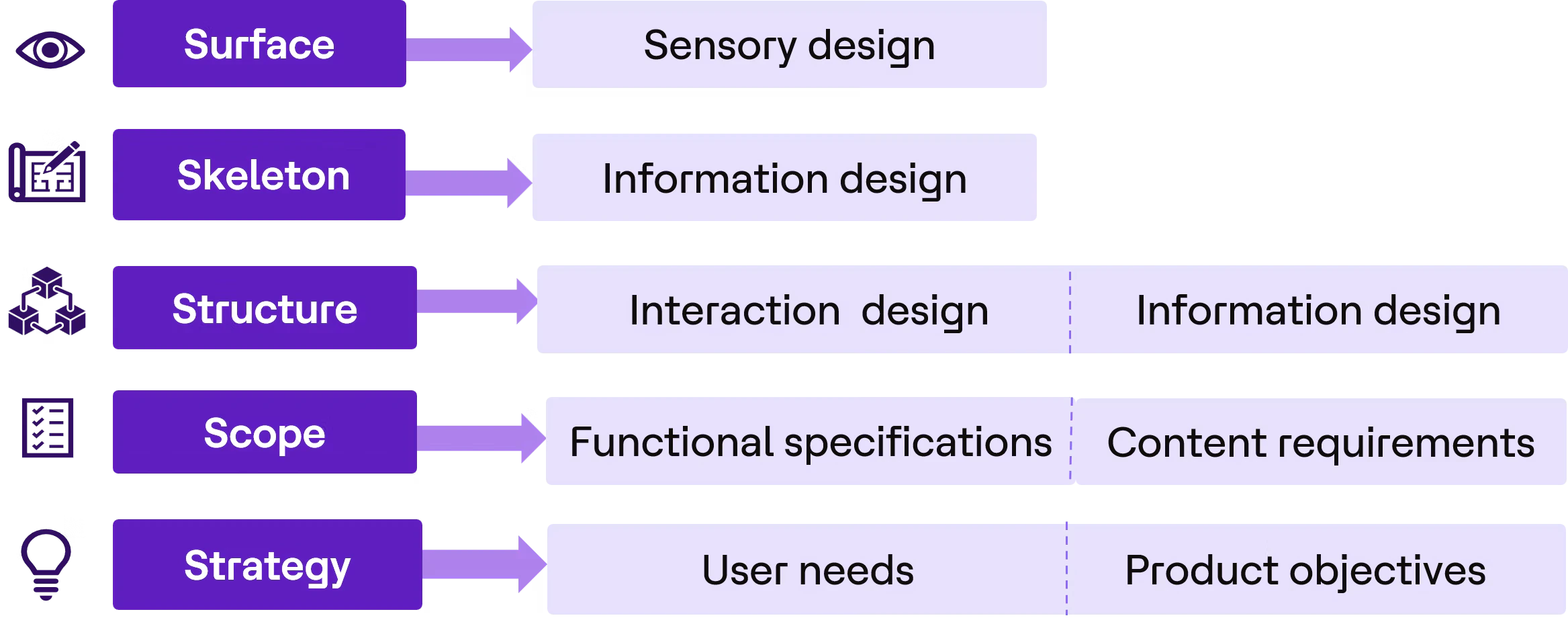
Garrett’s framework breaks design into five interconnected layers:
- Strategy
- Scope
- Structure
- Skeleton
- Surface
Think of it like preparing a burger:
- Strategy (the order): What are you making and why?
- Scope (the ingredients): What goes in and what stays out?
- Structure (the assembly order): How do the layers come together?
- Skeleton (the cooking): How is the form built and stabilized?
- Surface (the garnish): How does it look and feel?
Just as every layer matters in a burger, each plane matters in UX, especially in healthcare, where experience directly impacts efficiency, safety and outcomes.
The design thinking mindset
At the heart of the framework is design thinking, a human-centered approach that balances emotional, utility and convenience needs. It considers how users feel today versus how they want to feel, what they can do versus what they need to accomplish and how easily they can complete important tasks. In healthcare, this perspective becomes especially critical. Patients seek reassurance rather than anxiety, clinicians need speed and clarity under pressure and systems should reduce cognitive load rather than add to it.
With that mindset, let’s build our burger.
The strategy plane (the order)
Burger analogy: Before cooking, you decide what burger you’re making and for whom. A quick snack, a gourmet meal, or a health-focused option; each has a different purpose.
UX perspective: This plane defines why the product exists, who it serves and what success should look like. It anchors the experience in user needs, business goals and real-world context before teams move into features, workflows, or screens. In healthcare, this clarity is especially important because the strategy determines whether the product supports the right users, solves the right problem and improves outcomes in meaningful ways.
For example, teams may need to decide whether they are building a remote patient monitoring system for patients at home with chronic conditions, a real-time ICU dashboard for clinicians, or a patient app for medication adherence.
Each decision shapes everything that follows.
What teams do at this stage:
- Conduct clinician and patient interviews
- Observe workflows in hospitals or care settings
- Define clear success metrics
Example:
If designing an ICU dashboard:
- Goal → Reduce response time to critical alerts
- Users → Nurses and intensivists
- Outcome → Faster decision-making, fewer missed alerts
Without a clear “order,” teams risk solving the wrong problem, something healthcare systems cannot afford.
The scope plane (the ingredients)
Burger analogy: Once the order is defined, you choose the ingredients: patty, cheese, lettuce and sauces. Not everything belongs in every burger.
UX perspective: This plane defines what the product will include and, just as importantly, what it will leave out. It helps teams translate strategy into a focused set of features, content and capabilities that directly support user needs and product goals. For a patient monitoring system, the feature set might include.
For a patient monitoring system, the feature set might include real-time vitals tracking, alerts for abnormal readings, patient history and trends, predictive insights and messaging between clinician and patient. But not all features are equal.
What teams do at this stage:
- Define functional and content requirements
- Prioritize safety-critical features
- Align with constraints (regulations, timelines, integrations)
Example:
When designing an ICU dashboard, feature priorities will vary by care setting. Real-time alerts are essential in ICU environments, while trend analysis and adherence tracking may be more relevant for chronic care applications.
- Goal → Include the right features based on clinical urgency, user needs and care context.
- Outcome → A focused product scope that supports timely action without overwhelming users.
Just like an overloaded burger becomes hard to eat, a feature-heavy product overwhelms users, especially clinicians in high-pressure environments.
The structure plane (the assembly order)
Burger analogy: A burger isn’t just ingredients. You must assemble them in the right order. Otherwise, it becomes messy and hard to consume.
UX perspective: This plane defines how information and workflows are organized. In healthcare, structure translates into task flows, such as how a clinician moves from noticing an alert to reviewing the right patient context and taking action. If the flow is broken or scattered, clinicians waste valuable time.
What teams do at this stage:
- Design user journeys and workflows
- Organize information architecture
- Ensure consistent navigation patterns
Example:
If designing the alert response flow for a patient monitoring system:
- Flow → View alert severity → Access patient summary → Review historical vitals → Take action (acknowledge/escalate)
- Goal → help clinicians move from detection to action quickly
- Outcome → fewer workflow gaps, faster response and reduced cognitive load
Strong structure ensures users don’t have to “figure out” the system, especially during critical situations.
The skeleton plane (the cooking)
Burger analogy: Now you cook and assemble the burger, ensuring it holds together and is easy to eat.
UX perspective: This is where the structure defined in the previous plane becomes tangible through layouts, interfaces and interaction patterns. Abstract decisions about workflows, hierarchy and information relationships are translated into screens users can see, navigate and use. At this stage, teams decide how the content is arranged, which information appears first, how related items are grouped and where primary actions should be placed so users can complete tasks with clarity and confidence.
At this stage, teams should validate whether the interface supports fast, confident action in real-world conditions. For example, they should ask whether a nurse can respond to an alert within seconds, whether the data remains scannable during a busy shift and whether accessibility needs are met for long usage hours.
What teams do at this stage:
- Create wireframes and prototypes
- Define UI components (alerts, forms, tables, etc.)
- Conduct usability testing with real users
Example:
If designing a clinician dashboard layout:
- Layout →
- critical alerts placed prominently
- vitals grouped clearly
- actions kept within reach
- Goal → allow nurses to scan, understand and act within seconds
- Outcome → improved usability during busy shifts and better support for real-world clinical conditions
This stage ensures the system works in real-world healthcare conditions, not just in design mockups.
The surface plane (the garnish)
Burger analogy: The garnish makes the burger appealing: presentation, finishing touches and sensory delight.
UX perspective: This plane defines how the interface looks and feels, but in healthcare, visual design is not only about aesthetics. It directly influences how quickly users notice information, how accurately they interpret severity and how confidently they respond. Color, contrast, typography, spacing, iconography and feedback states all help communicate priority and meaning. When these choices are clear and consistent, they reduce hesitation and support safer decisions. When they are unclear, overly subtle, or inconsistent, they can increase cognitive load and make critical information easier to miss.
Poor design at this layer can cause users to miss alerts, experience increased fatigue and lose trust in the system.
What teams do at this stage:
- Apply visual design and branding
- Ensure consistency across screens
- Add micro-interactions for feedback
Example:
If applying visual design to a clinical monitoring interface:
- Visual treatment →
- red for critical alerts
- high contrast for readability
- subtle feedback for acknowledged actions
- Goal → create clarity, trust and confidence during clinical decision-making
- Outcome → fewer missed signals, reduced fatigue and stronger confidence in the system
In medtech, the “garnish” isn’t just aesthetic; it directly supports clarity, trust and decision-making.
Together, the five planes guide teams from understanding user and business goals, through defining features and organizing workflows, to building usable interfaces and effective visual experiences. Each plane builds on the one before it, helping teams make deliberate decisions rather than treating design as a series of isolated activities.
Ultimately, the 5 Planes Framework reminds us that great experiences are intentional. Every visual element, interaction, workflow and feature traces back to a deeper understanding of user needs and business goals. This philosophy also sits at the heart of Total Experience (TX), where experience design is combined with emerging technologies, compelling content and thoughtful communication to create connected experiences across the entire user journey. By putting purpose before pixels and people before technology, organizations can build solutions that are not only usable and engaging but also meaningful and impactful. For TX opportunities and collaborations, reach out to totalexperience@hcltech.com.
References:

