


All Blogs


Our Areas of Expertise
With expertise in Digital, Engineering and Cloud, we deliver solutions that fulfill the traditional, transformational and future needs of clients across the globe.


Digital
HCLTech’s end-to-end Digital offerings enable enterprises to increase business resilience, improve operational efficiency and deepen client engagement.


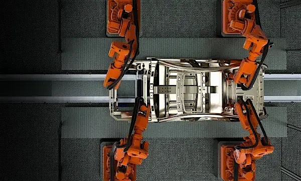
Engineering
HCLTech Engineering and R&D services (ERS) empower enterprises to improve time-to-profit, accelerate product development and maximize return on innovation.
Explore our Engineering Services


Cloud
HCLTech’s exclusive CloudSMART offerings and services enable organizations to optimize cloud to accelerate innovation and agility at scale.

AI
HCLTech empowers organizations across industries to identify and seize opportunities to leverage AI and GenAI to automate and accelerate business processes.